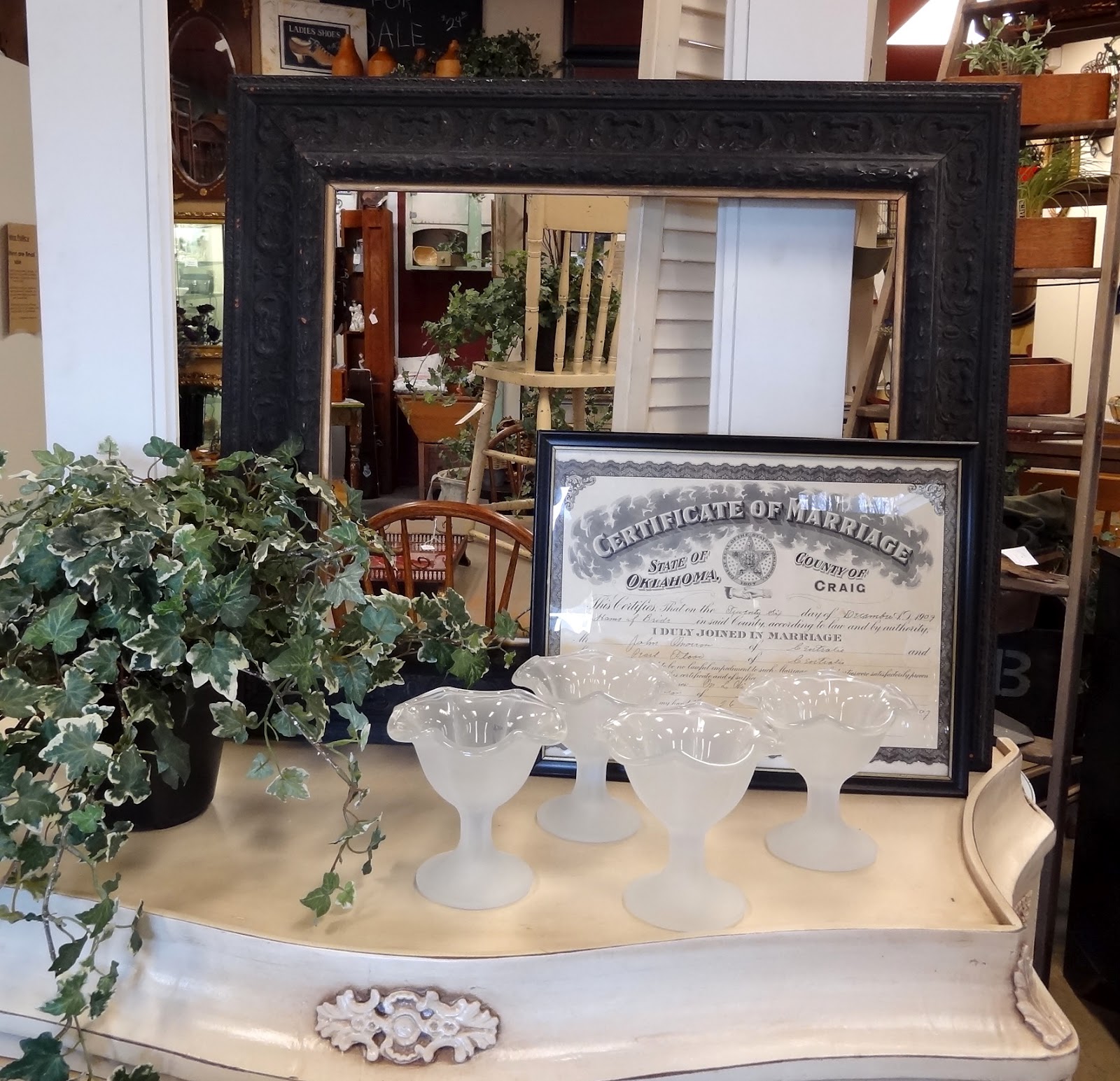
I went out to the shop, Aubergine Emporium, on Sunday which is my usual custom and practice. Pat put together this great vignette of black and white and cream. I think it looks great. I love the color combo. It reminds me of vintage aged paper with faded black print. Everything here has French flavoring in it, but the textures and the paint finishes are all different, yet it all works perfectly together. The delicate French chair is covered with leather.
The frame below is aged to perfection. It's just chippy enough to give it character. I can just imagine the old photos it used to contain.
These bird prints are wonderful. I just might have to try my hand at something like this with an image from the Graphics Fairy.
Isn't this sign great? I didn't paint it, but I wish I had. The words say it all.
Below is another example of black and creams and neutral. This is brown mailing paper on the walls just tacked up with the riding hats and a wood mirror with beveled glass. The riding hats are surrounded by a large gold frame. This is a great look without being too feminine but still it is soft enough that it's not too masculine.
Hi, my name is Maggie. I have worked in the legal field for 27 years, but my real passion is finding treasures and restoring or repurposing them. I love everything French. I have been a dealer in different antique malls for the past 12 years and for the past six years have been a dealer at Aubergine Emporium in Simi Valley, California. I am also a vendor at The Little French Flea Market in Tarzana, California. I absolutely love the hunt.


.JPG)


2 comments:
No doubt about it, I just like signs. I think someone could put gibberish on one and I'd want to hang it in my house.
~Bliss~
I love the color combinations of black, white and cream...That is our bedroom colors with a little pale green...
yes..and pretty fun signs!
Post a Comment