Here is the sign I wanted to post about yesterday, but unfortunately it took me two days to finish it. I can't begin to do a tutorial on this because it would make us all crazy. Let's just say I did not have to purchase any stencils to get it done because I had everything on hand. Yeah, I know. I'm a little crazy. However, some of these stencils I have had for at least 10 to 12 years. I made several mistakes doing the layering of this sign. It is about 5 feet wide and even though I am very experienced at painting signs on cabinet doors, it never occurred to me that the knob, which I wanted to keep, wasn't centered. Duh! Oh well. My lettering isn't totally level either because by this morning I was starting to freehand a few things like the Old English lettering at the top and the brandy at the bottom is off a little too. I will tell you though, I do love the finished product. I always intend for my signs to look hand done, aged, and, of course, they are all one of a kinds.
Another thing I should mention is that I sell a lot of old authentic advertising signs and displays and I shy away from tobacco and alcohol related items. I don't like to encourage vices in people. No judgment here. I have plenty of my own vices and my husband would say blogging is at the top of the list. That said, I was looking for inspiration to do some layering of images and typography, and this one captured my attention the moment I saw it. So I stayed true to the subject matter. Besides, it's French and who can resist a Frenchman?
I was looking for layered inspiration and this vintage label delivered in spades.
You can totally tell my Old English printing is freehand. I finally taped it off to keep it level. It was hard to keep the word brandy level because I was working right up against the frame. I also freehanded the bell.
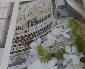
Here is a blurry picture of what inspired me. Yep, this is all I could see. I researched this on the internet and found a modern version of the label to help me get the wording correct. In case you are wondering it is from the 2012 3rd edition of Jeanne d' Arc Living Magazine.
I used a magnifying glass to make out the words so I could research the label and hopefully find a copy on the internet, but I did not find an exact match. I still love my sign. I guess you could say it was a copy cat challenge of sorts.
Thanks so much for visiting. I love it when you drop by.
One last thing. Here is the door before I went to work on the transformation. Hope you all have a wonderful weekend.
I'm partying at...
Mondays Le Chateau des Fleurs The Graphics Fairy Metamorphosis Monday
Tuesdays Knick of Time Tutus and Tea Parties Coastal Charm
Boogie Board Cottage A Stroll Thru Life
Wednesdays Savvy Southern Style Ivy and Elephants Faded Charm Cottage
Fine Craft Guild
Thursdays Embracing Change The Shabby Creek Cottage No Minimalist Here
Between Naps on the Porch Tablescape Thursday Fishtail Cottage
Rustic Restorations Homespun Happenings
Fridays French Country Cottage My Romantic Home Miss Mustard Seed
At the Picket Fence Potpourri Friday Common Ground
The Charm of Home Decorating Insanity Rooted in Thyme
Saturdays Funky Junk Interiors
Sundays It's Overflowing


Wow! Amazing, Maggie! I especially love it because I went to Nuits-Saint-Georges when I was in school in Dijon...such a pretty place...lots of vineyards! Happy weekend!...hugs...Debbie
ReplyDeleteLove this...and so many of your creations...have always wanted a similar technique but on a mirror..as in French advertising, same size, too...have you done anything like that?
ReplyDeleteYou did a great job!! I love your blog!
ReplyDeleteFantastic sign! I can totally relate to the not staying straight part. I've painted many signs and very rarely does everything come out perfectly in line. Usually, you're the only one who even notices, and if you hadn't pointed it out, I wouldn't have caught it. I love that you painted it on an old door for more character. Very fun piece!
ReplyDeleteFreaking awesome. I love it. And holy crapola, that's big!
ReplyDelete~Bliss~
I too love your blog and your work! This piece is awesome!
ReplyDeleteOH my goodness, Maggie, that is so beauitful. As a painter myself, there's so much work you put into it. It is beyond beauitful! I hope you're going to put it in Aubergine so I can stop by and see it in person!
ReplyDeleteWow! It's simply stunning! That's quite an amazing "freehand" you have! Quelle artiste!;) xoxo
ReplyDeleteWow, Maggie! This is indeed incredible.
ReplyDeleteI'm more impressed with the free hand and the amount of talent you have for making that look incredible. This whole project turned out amazing and totally professional looking. Perfect color, too.
Your freehanding is impressive! Found you at MMonday.
ReplyDeleteI like your French Sign very much done up in Blue. Very pretty, Not one would notice that the knob isn't perfectly centered. I am a new follower and am looking for more participants in my Summer Vintage hatbox swap. Come check it out, It looks like something you would enjoy doing.
ReplyDeleteThanks so much for joining the French party! Come back on Mondays!
ReplyDeleteXO