Saturday, May 26, 2012

Patriotic Award Ribbons

My inspiration for these prize ribbons came from searching around on Pinterest.  I couldn't find the tutorial so I made my own.  My ribbons are patriotic as you can see.  I made a dozen so that I could spruce up my space at the shop for the holidays.
 I made these out of cupcake and candy holders, the decorative kind.  I used a one-inch width ribbon in a check or stripe, a transparent ribbon in red or white that was also one-inch wide.  Then I used a half-inch ribbon of my choice (whatever I had on hand) and I chose another ribbon that was quarter-inch wide.  For the middle of my circle I used a silk corn flower with a yellow center.  I thought daisies would look cute too.  Or you could make your own centers as well.

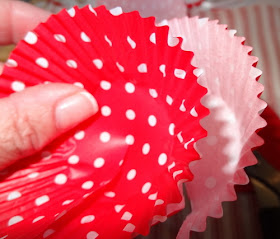
 Start with the cupcake holders.  I made a slit into each one of the holders so they would open up wider and then I staggered the slits so they would not be noticeable.  Start with one regular cupcake holder.  Make your slit and keep it in the direction it would usually go.  Then take two more regular sized cupcake holders, make your slits, and reverse them so when you look into the flower you see the printed side.  I used one more regular sized holder and trimmed it a little to make another layer.  Reverse the direction of this cupcake holder and glue in into the flower at this point.  Remember to stagger your slits.  Now take three of the candy holders and do exactly the same thing, one going in the regular direction and two reversed.  Remember you are looking into the pattern and you want to see the printed side, not the side that you would normally put your batter into.  Now you have a pretty full backdrop.  At this point I took the corn flower off of the stem, snipped the back of it so I could glue it flat into the center.  BTW, each layer is being glued with a glue gun. 
 You can see the progression of the layers.  Because I staggered the slits, you can hardly see them.
Now I placed the flower as a center.
At this point I took clear Valspar finishing spray and sprayed the whole cupcake configuration, flower and all.  Then I took fine iridescent white glitter and sprinkled it onto the sprayed flower.  Just made it a little bit sparkly. 


 I should have started out by telling you to cut card stock into circles to use as your backs.  I traced a custard cup onto the paper, cut my circles and then trimmed them down to fit the back of my cupcake holders.  They can be a little bit larger but not too large.  I found that I liked it with the twelve-inch strips of ribbon rather than the six.  I made three of these little award ribbons with shorter lengths of ribbon and I just didn't like them.  Cut two 12-inch pieces of your bold 1-inch width ribbon.  Glue them onto the circle.  Cut two 12-inch strips of your sheer ribbon and glue on top of your first layer of ribbon.  Do the same with your half-inch and quarter-inch width ribbon.  Once that is glued, take a paper clip and glue it down so you have something to tie a piece of ribbon to so you can hang this when it is finished.  Now glue your cupcake holders on to your circle card stock and you are done except for attaching a skinny piece of ribbon through the paper clip so you will be able to hang up your finished product.  These directions may be a little confusing so use the pictures as a guide.  Thanks for stopping by.
Pin It

I'm partying at...


Mondays          The House in the Roses       Le Chateau des Fleurs        The Graphics Fairy
                                      Metamorphosis Monday
Tuesdays          Knick of Time       Tutus and Tea Parties       Coastal Charm  
                                      Boogie Board Cottage    A Stroll Thru Life
Wednesdays     Savvy Southern Style         Ivy and Elephants        Faded Charm Cottage            
                                     Fine Craft Guild      
Thursdays        Embracing Change     The Shabby Creek Cottage    No Minimalist Here 
                                     Between Naps on the Porch Tablescape Thursday
Fridays            French Country Cottage       My Romantic Home        Miss Mustard Seed
                                    At the Picket Fence     Potpourri Friday     Common Ground
                                    The Charm of Home    Decorating Insanity
Saturdays        Funky Junk Interiors

Sundays           It's Overflowing

Friday, May 25, 2012

Chippy Red Bed

One photograph of this bed kind of says it all.  My husband would have put this bed in the trash for sure, however, if you love chippy peely paint, this is right up your alley.  I bought this bed from the sweet hoarder lady I purchased my primitive cabinet from.  In fact, she was so sweet, I felt good about everything I purchased from her.
 I hosed it down to get all the excess peeling paint off of it and this is what remained.  It has a certain charm about it, don't you think?  Great for a beach cottage look.  I love the red with all of my aqua furniture.  Here I cleared out the furniture in the middle to reveal a little more of its charm.  That little trunk in the middle of the bed is actually a new piece.  It was a prop in Johnny Depp's Pirates of the Caribbean movie.
Yes, this bed has seen better days, but I still couldn't resist it.  We do have a customer base that loves this kind of stuff.

 On another funky note, it is now prohibited in the State of California to sell taxidermy items.  So what are we to do with our store mascot?  We dress him up for all the holidays.  Yeah, I know,  very silly, but we do have a lot of fun.  After all, my motto is if it's not fun, don't do it!  So I hope you all have fun this Memorial Day weekend.  It's my husband's birthday too so we have a double celebration going on.
Pin It

I'm partying at...


Mondays          The House in the Roses       Le Chateau des Fleurs        The Graphics Fairy
                                      Metamorphosis Monday
Tuesdays          Knick of Time       Tutus and Tea Parties       Coastal Charm  
                                      Boogie Board Cottage    A Stroll Thru Life
Wednesdays     Savvy Southern Style         Ivy and Elephants        Faded Charm Cottage            
                                     Fine Craft Guild      
Thursdays        Embracing Change     The Shabby Creek Cottage    No Minimalist Here 
                                     Between Naps on the Porch Tablescape Thursday
Fridays            French Country Cottage       My Romantic Home        Miss Mustard Seed
                                    At the Picket Fence     Potpourri Friday     Common Ground
                                    The Charm of Home    Decorating Insanity
Saturdays        Funky Junk Interiors

Sundays           It's Overflowing

Thursday, May 24, 2012

Liberty Garden Bucket

It's that time of year when we start thinking of patriotic themes.  I have had this red bucket for over a year waiting to come up with an idea for it.  When I purchased it, it was painted a strange yellow with a blue green wash on the inside.  I repainted the inside with dark green and the outside with colonial red.  Both Rustoleum sprays.  The bucket also had a slight dent in it which doesn't bother me on old buckets, but I didn't want to put a lot of effort into hand painting it either.  


While I was doing an internet search of produce crate labels, this one popped up.  Not only was it patriotic but it had red and green in it as well.
I printed out the label in the full size 8x10 on my color copier.  Then I took my barbecue lighter and torched the edges.  Do this outside, not where you can set the house on fire please.  Make it a controlled burn as well.  That means keep your eye on the flame.  That might be obvious, but when your husband comes out and asks what on earth are you doing, and you pay more attention to telling him what you're up to, your whole label could go up in flames in that short amount of time.  Please don't ask me how I know these things.  Just take my word for it.

By spot burning the label, it got that naturally torn and worn look.  Then I used my 3M Super 77 spray adhesive and sprayed the back of the label and attached it to the bucket.  Yes, that's right, right over the little dent which is now completely camouflaged.  When this step is complete, spray the label with Krylon Crystal Clear to seal in the dyes on your label.
Doesn't the burned area look just like it tore naturally with time?
Hoping you have a wonderful Memorial Day weekend.  Here is the image if you would like to use it on a project.  It is already aged.
Pin It

I'm partying at...


Mondays          The House in the Roses       Le Chateau des Fleurs        The Graphics Fairy
                                      Metamorphosis Monday
Tuesdays          Knick of Time       Tutus and Tea Parties       Coastal Charm  
                                      Boogie Board Cottage   
Wednesdays     Savvy Southern Style           Primp         Faded Charm Cottage            
                                     Fine Craft Guild      Ivy and Elephants
Thursdays        Embracing Change     The Shabby Creek Cottage    No Minimalist Here 
                                     Tablescape Thursday   Delightfully Inspiring Thursdays
Fridays            French Country Cottage       My Romantic Home        Miss Mustard Seed
                                    At the Picket Fence     Potpourri Friday     Common Ground
                                    The Charm of Home    Decorating Insanity
Saturdays        Funky Junk Interiors

Sundays           It's Overflowing

Wednesday, May 23, 2012

French Bee Farm

This project was made with the third cabinet door I purchased with the two I used for the French Menu Boards I did a couple of weeks ago.  It started out to be another menu board, but I got a little sidetracked when I saw a "Miel" sign with a bee hive on it and used that as my inspiration.  By the way, miel means honey in French.
The only thing I would have done differently is I wish I would have done the words in a different order and showcased the name of the farm in the middle.  Other than that, I think it turned out fine.  Here is how I painted the sign.
 I started with a base coat color of Swiss Coffee.  Any brand will do.  I personally always use an exterior paint in case people want to put my signs outdoors.  I don't think chalk paint will hold up outdoors and neither will the wax.  FYI, once you use wax on a project, you cannot repaint the piece because paint won't stick to the wax.  I know Annie Sloan's representatives swear you can paint over it with their paint and I did attend their workshop, but I have my doubts. 

Now back to my project.  I adhered the wreath applique I purchased from Bella Cottage (they have a website that you can order from), and then I planned my design.  I went to Graphics Fairy and downloaded one of her beehive images and printed it in the postcard size.  Then I cut it out and merely traced around it and then filled it in with a paint pen.  I seriously cannot draw so the only thing on this sign that is free hand is that little bee.  Yes, that is a bee and not a fly!

Next I chose my text and lettered the sign in black.  I came back and did some outlining in a colored called Maple Sugar.  It's a Delta acrylic paint I have had for years.  This finished off the bottle.  I used the same color to paint in some of the ridges of the moulding on the cabinet door.  Then in between that I painted some black trim.  I didn't want to use my regular stain on this so I found some water based gel stain in the cupboard and applied that.  It gave it kind of an overall crystallized honey tone which was a good thing because this project is about bees.  You can see in the next photo the difference with and without the stain.   Either way looks good.  I just usually do this extra step to age the sign.  The final step was to spray the project with a clear flat coat to seal everything in.  Use one that is suitable for outdoors if you are making a garden sign.


I'm partying at...


Mondays          The House in the Roses       Le Chateau des Fleurs        The Graphics Fairy
                                      Metamorphosis Monday
Tuesdays          Knick of Time       Tutus and Tea Parties       Coastal Charm  
                                      Boogie Board Cottage    A Stroll Thru Life
Wednesdays     Savvy Southern Style         Ivy and Elephants        Faded Charm Cottage            
                                     Fine Craft Guild      
Thursdays        Embracing Change     The Shabby Creek Cottage    No Minimalist Here 
                                     Between Naps on the Porch Tablescape Thursday    Homespun Happenings
Fridays            French Country Cottage       My Romantic Home        Miss Mustard Seed
                                    At the Picket Fence     Potpourri Friday     Common Ground
                                    The Charm of Home    Decorating Insanity
Saturdays        Funky Junk Interiors

Sundays           It's Overflowing
Tuesday, May 22, 2012

French Script Pears

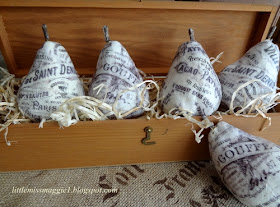
Harry & David move over.  Little Miss Maggie is selling pears (in a fancy wooden box no less).  For this project I used three Graphics Fairy images copied onto my homemade script tissue paper.  If you haven't seen this method click here.  However for this project I simply used scotch tape and taped the bottom and the top of the tissue paper to my regular copy paper and fed it through the copier.  It was less messy and I was in a rush.  Worked just as well.


I am totally smitten with these pears.  They turned out great and I have 7 more pears to work on.  The following photo was my inspiration.  I was trying to duplicate the look of my apples I purchased and I have used these in my photos before.  They are great too, but I do love these darn pears.
The pears I started with were plain plastic pears.  I bought a dozen of them at the flea market for $1.  Super deal if you ask me.  I painted them white with acrylic craft paint.
Then I selected my images and printed 3 X 5 copies of the images to keep the scale correct to work with the pears.  Don't make huge copies.  Your print and image will get lost on the fruit.

I put all three images on one sheet of paper to copy on my tissue paper.  Even though I did five pears, it took 7 copies to do all five.  This was because I wanted to cover 95 % percent of my surface and at the end I had to cut out little words and decoupage into the small spaces that were still white and blank.  Work in sections and let them dry to the touch and then continue working.  The tissue is thin and you don't want to tear it because you are touching it with sticky hands.
The next photo is the white pears and the copies of my tissue paper.

My experience with the tissue is that used tissue paper works best.  It gives me the look I want which is vintage or antique.  I personally don't like new looking stuff.  I want patina on all my projects.  This is totally a matter of preference so you do what works for your taste.  Also I printed the images in sepia tone, not black, and I made color copies of the images to maintain the brown coloration.

Cut out your sections you want to use.  Each pear took two complete images, one for the front and one for the other side.  You can see I cut into the copy with slits so that I could get things to lay flat.  Decoupage away.  If you have blank spots, and you will, cut little words out and fit them in between so you don't see white.  You can use any image for this.  I do like the Graphics Fairy images, but if you like my French script papers I have shared just save them to your computer, print them in the 3 X 5 size and do the same procedure.  Happy crafting.  I love your comments.  I try to reply to every one of them unless you are a no reply blogger.  

Pin It

I'm partying at...


Mondays          The House in the Roses       Le Chateau des Fleurs        The Graphics Fairy
                                      Metamorphosis Monday
Tuesdays          Knick of Time       Tutus and Tea Parties       Coastal Charm  
                                      Boogie Board Cottage    A Stroll Thru Life
Wednesdays     Savvy Southern Style         Ivy and Elephants        Faded Charm Cottage            
                                     Fine Craft Guild      
Thursdays        Embracing Change     The Shabby Creek Cottage    No Minimalist Here 
                                     Between Naps on the Porch Tablescape Thursday
Fridays            French Country Cottage       My Romantic Home        Miss Mustard Seed
                                    At the Picket Fence     Potpourri Friday     Common Ground
                                    The Charm of Home    Decorating Insanity
Saturdays        Funky Junk Interiors

Sundays           It's Overflowing

Monday, May 21, 2012

Take Notes

Here is an easy inexpensive project for making fun notebooks.  You may be hosting an event where people need to take notes or do sketches or cut and paste pictures into a notebook.  Start with an inexpensive composition notebook.  I bought these at the market for 1.99 but you can probably find them at the Dollar Store too.
 The two covers I used are Graphics Fairy images as well as the script I used on the back of the notebook.  I just made my copies to fit, cut out the shape.  The notebooks come with a black binding already.  I used spray glue to attach the image to the notebook.
 Super easy, super quick, super inexpensive.
I instantly fell in love with the image above the moment I saw it and knew I wanted to do something fun with it  click here.  Then recently she shared this next one and I had a pair of images to work with.
 Happy crafting.  Thanks so much for stopping by.  I always enjoy your visits.
Pin It

I'm partying at...


Mondays          The House in the Roses       Le Chateau des Fleurs        The Graphics Fairy
                                      Metamorphosis Monday
Tuesdays          Knick of Time       Tutus and Tea Parties       Coastal Charm  
                                      Boogie Board Cottage    A Stroll Thru Life
Wednesdays     Savvy Southern Style         Ivy and Elephants        Faded Charm Cottage            
                                     Fine Craft Guild      
Thursdays        Embracing Change     The Shabby Creek Cottage    No Minimalist Here 
                                     Between Naps on the Porch Tablescape Thursday
Fridays            French Country Cottage       My Romantic Home        Miss Mustard Seed
                                    At the Picket Fence     Potpourri Friday     Common Ground
                                    The Charm of Home    Decorating Insanity
Saturdays        Funky Junk Interiors

Sundays           It's Overflowing

Sunday, May 20, 2012

Lunch with Lady Gobel

Today I want to share this lovely vintage china with you.  I have never seen it anywhere else.  It belonged to my friend Sue who I have enjoyed tea with throughout the years.  She found it in Ohio so maybe it was a regional thing in the Midwest.  The name of the pattern is Lady Gobel and it was manufactured by Hamilton Rose.


The china has the sweetest ladies on it that for some reason remind me of Scarlett O'Hara and Melanie Hamilton from Gone with the Wind.

I invited my beautiful wired cloche I made a couple of weeks ago.  She fits right in with her hoop skirt and delicate ribbon.

The white charger plates are from Home Goods.
My daughter Stephanie did a beautiful job displaying the pastries.

I set the candle sticks on a vintage letter and also used my paper script flowers.  I purchased a couple of these stems, but I am going to try to make them to recreate them for you.  They are beautiful and simple.

Thanks for visiting.  If anyone has seen this china pattern before, please drop me a note.  I would love to hear from you.
Pin It

I'm partying at...


Mondays          The House in the Roses       Le Chateau des Fleurs        The Graphics Fairy
                                      Metamorphosis Monday
Tuesdays          Knick of Time       Tutus and Tea Parties       Coastal Charm  
                                      Boogie Board Cottage    A Stroll Thru Life
Wednesdays     Savvy Southern Style         Ivy and Elephants        Faded Charm Cottage            
                                     Fine Craft Guild      
Thursdays        Embracing Change     The Shabby Creek Cottage    No Minimalist Here 
                                     Tablescape Thursday   Delightfully Inspiring Thursdays
Fridays            French Country Cottage       My Romantic Home        Miss Mustard Seed
                                    At the Picket Fence     Potpourri Friday     Common Ground
                                    The Charm of Home    Decorating Insanity
Saturdays        Funky Junk Interiors

Sundays           It's Overflowing