This past week one of my projects was to age a still life canvas I have had for sale for a very long time at my space. It was encased in a frame that was black and gold. The frame was lovely, however, in the current marketplace I wanted to update the look of the frame. We sell a lot of empty frames at the shop and this one is large enough to do a whole grouping of small art inside of it.
I simply sprayed the frame with primer gray. It's a nice deep gray and it actually brought out the beautiful detail in the frame's design.
Next I went over the gray with gesso and just wiped it back. Some of you may like this look. I have done this and left the project this way without any further steps. However, for this frame I wanted to give it a little more dimension so I took my Jacobean Minwax stain and went over the frame once again. The stain dissolved some of the paint revealing a little of the gold that was underneath. I really like this aged worn look.
I think now I can sell both the frame and the canvas print that it was attached to.
This is how the frame started out. Our clientele at the shop is not as traditional as this frame so an updating was definitely in order. Thanks so much for your visit.

I'm partying at...
Mondays The House in the Roses Le Chateau des Fleurs The Graphics Fairy
Metamorphosis Monday
Tuesdays Knick of Time Tutus and Tea Parties Coastal Charm
Boogie Board Cottage A Stroll Thru Life
Wednesdays Savvy Southern Style Ivy and Elephants Faded Charm Cottage
Fine Craft Guild
Thursdays Embracing Change The Shabby Creek Cottage No Minimalist Here
Between Naps on the Porch Tablescape Thursday
Fridays French Country Cottage My Romantic Home Miss Mustard Seed
At the Picket Fence Potpourri Friday Common Ground
The Charm of Home Decorating Insanity
Saturdays Funky Junk Interiors
Sundays It's Overflowing
Saturday, May 19, 2012
Friday, May 18, 2012
Paris Waste Bin
I am not sure I like the way this turned out, but it's okay because I am putting it in my office to maybe help me keep my scraps more organized. That means instead of having them all over the floor and nearby areas by my copier, I can drop them right into this receptacle, and since it has a large opening, there is no way I can miss.
I found this at a yard sale. The way it started out is the final picture in this grouping. It was ugly pine. I'll go to Wal-mart and get a trash bin to place inside the cabinet. The top lifts up to deposit the trash and then when you want to empty it, you open the doors and remove the whole bin.
The color I chose is called So Cool. It's a Valspar paint I bought at Do-It Center. Then I used a plain Jane stencil I purchased at Michael's Craft Store and stenciled my pattern in white.
The brown splotches are supposed to look like worn wood spots. I have seen this done and have wanted to try it. I had nothing to lose so this was my experimental attempt. Okay, now I am over it. Won't do it again. Next time I'll use my sander like I am used to.
Below you can see the white stenciled pattern. I rummaged through my acrylic paints and found a metallic paint called Champagne. I love champagne so I decided to give the color a try. I just went over the stenciled white and kind of filled in randomly with the champagne color.
Next I used an acrylic paint called Wicker. It's sort of a brown beige color. I just used the liner brush and sort of randomly outlined the stencil.
Below is the picture of how it started. Super ugly. So whatever I did to this piece was an improvement to say the least. I'll keep working on my painting skills, but in the meantime maybe I can get better organized with this little treasure. Thanks so much for stopping by.
I'm partying at...
Mondays The House in the Roses Le Chateau des Fleurs The Graphics Fairy
Metamorphosis Monday
Tuesdays Knick of Time Tutus and Tea Parties Coastal Charm
Boogie Board Cottage A Stroll Thru Life
Wednesdays Savvy Southern Style Ivy and Elephants Faded Charm Cottage
Fine Craft Guild
Thursdays Embracing Change The Shabby Creek Cottage No Minimalist Here
Between Naps on the Porch Tablescape Thursday
Fridays French Country Cottage My Romantic Home Miss Mustard Seed
At the Picket Fence Potpourri Friday Common Ground
The Charm of Home Decorating Insanity
Saturdays Funky Junk Interiors
Sundays It's Overflowing
Thursday, May 17, 2012
Book Review Part 2
Today I am doing part 2 of a post I did a week ago. If you missed the post and would like to see it click here. As I wrote last week, I found this book at the flea market and it is still available on Alibris.com and Amazon in used form of course since it was published in 1999. I have to say I am sure I have seen this artist's work before and obviously appreciated this man's talent, but after seeing this collection of his work, I think I am going to become obsessed. He designed a line of plates in black and white that I must get my hands on. I love beautiful china and toiles are at the top of my list. Oh, I almost forgot. The incredible artist is Graham Rush and the title of the Book is Decorative Designs. Last week I shared some of his neutrals and sepia tones, and this week I am sharing some of his colored works. As I stated before, my photography does not do his work justice. I am merely sharing this man's wonderful talent with you in case you are not familiar with his work.
I'm partying at...
Mondays The House in the Roses Le Chateau des Fleurs The Graphics Fairy
Metamorphosis Monday
Tuesdays Knick of Time Tutus and Tea Parties Coastal Charm
Boogie Board Cottage
Wednesdays Savvy Southern Style Ivy and Elephants Faded Charm Cottage
Fine Craft Guild
Thursdays Embracing Change The Shabby Creek Cottage No Minimalist Here
Tablescape Thursday Delightfully Inspiring Thursdays
Fridays French Country Cottage My Romantic Home Miss Mustard Seed
At the Picket Fence Potpourri Friday Common Ground
The Charm of Home Decorating Insanity
Saturdays Funky Junk Interiors
Sundays It's Overflowing
Cover of the book |
Pumpkin from page 110 |
Commissioned by Halcyon Days for an enamel box from page 90 |
Colorful still life from page 80 |
Study of a nightingale from page 41 |
Study of a red and yellow "parrot tulip" from page 12 I just did a tablescape with this very flower. Yummy! |
Magic cabbage from page 158 |
Bookplate showing view of Suffolk Village from page 141 |
Sketch of the artist's French Bulldog Stella from page 103 |
Stella with color added from page 100 |
Scene from Cinderella from page 113 |
I'm partying at...
Mondays The House in the Roses Le Chateau des Fleurs The Graphics Fairy
Metamorphosis Monday
Tuesdays Knick of Time Tutus and Tea Parties Coastal Charm
Boogie Board Cottage
Wednesdays Savvy Southern Style Ivy and Elephants Faded Charm Cottage
Fine Craft Guild
Thursdays Embracing Change The Shabby Creek Cottage No Minimalist Here
Tablescape Thursday Delightfully Inspiring Thursdays
Fridays French Country Cottage My Romantic Home Miss Mustard Seed
At the Picket Fence Potpourri Friday Common Ground
The Charm of Home Decorating Insanity
Saturdays Funky Junk Interiors
Sundays It's Overflowing
Wednesday, May 16, 2012
Aging a Canvas Print
Let me start out by saying that I really liked this canvas the way it was originally. My personal style tends to be very traditional. However, I have had this canvas print in the frame for 10 years in my various spaces at the malls, and it has not sold. Now, it hasn't been visible to my customer base for that whole time because if I would bring in a large cabinet to sell, I would stick it in front of this piece of art. I don't know what it was about it that didn't make it sell, but it did not. So finally I brought it home from my space and put it in the Goodwill pile.
The following photo is how it started out. I took it to the Goodwill with a bunch of other stuff, but I just couldn't leave it. I do really like still life art. So I decided right then and there, I would do an experiment on it since I had nothing to lose at this point anyway.
I have also over the years sold what I call "old world" art. That is, new pieces that they make to look really old and beat up. I bet I have sold a hundred of those over the years, but not this new looking stuff. I had to keep reordering them because I would sell out. So here is what I did to age this canvas. By the way, the most effort I put into this was getting the art out of the darn frame! The rest was a piece of cake.
Once the still life was free of its frame, I took medium grit sand paper and sanded it down. Then I wiped it down with a damp cloth. Then I took my Jacobean stain by Minwax and rubbed it into the canvas front and back. No point making the front look old and leaving the back looking new. Next I took some raw umber craft paint and painted the sides of the canvas to cover the staples and the white canvas that was exposed. After all, I wanted it to look old .
Here is the back. I actually left stains on it. At this point it had a much softer, older appearance. I loved the way it looked, but it still did not mimic the old world look of my other canvases that have been huge sellers for me.
So next I took gesso and rubbed it into the canvas (front only). This lightened it up and gave it a calcified look. The frame you see is another project I did. That is the frame it came with and I want to sell that as well.
Now it was a little too light so I repeated the Jacobean stain again on the front side only. When this was dry, I sprayed it with a clear flat spray to seal the stain. Now it does have the look I was going for. The piece does not need a frame as I darkened the sides and the staples to match the look. I am really pleased with the results and will be looking for more prints to play with in the future. Thanks for visiting.
I'm partying at...
Mondays The House in the Roses Le Chateau des Fleurs The Graphics Fairy
Metamorphosis Monday
Tuesdays Knick of Time Tutus and Tea Parties Coastal Charm
Boogie Board Cottage A Stroll Thru Life
Wednesdays Savvy Southern Style Ivy and Elephants Faded Charm Cottage
Fine Craft Guild
Thursdays Embracing Change The Shabby Creek Cottage No Minimalist Here
Tablescape Thursday Delightfully Inspiring Thursdays
Fridays French Country Cottage My Romantic Home Miss Mustard Seed
At the Picket Fence Potpourri Friday Common Ground
The Charm of Home Decorating Insanity
Saturdays Funky Junk Interiors
Sundays It's Overflowing
Canvas after aging. |
I have also over the years sold what I call "old world" art. That is, new pieces that they make to look really old and beat up. I bet I have sold a hundred of those over the years, but not this new looking stuff. I had to keep reordering them because I would sell out. So here is what I did to age this canvas. By the way, the most effort I put into this was getting the art out of the darn frame! The rest was a piece of cake.
Once the still life was free of its frame, I took medium grit sand paper and sanded it down. Then I wiped it down with a damp cloth. Then I took my Jacobean stain by Minwax and rubbed it into the canvas front and back. No point making the front look old and leaving the back looking new. Next I took some raw umber craft paint and painted the sides of the canvas to cover the staples and the white canvas that was exposed. After all, I wanted it to look old .
Here is the back. I actually left stains on it. At this point it had a much softer, older appearance. I loved the way it looked, but it still did not mimic the old world look of my other canvases that have been huge sellers for me.
So next I took gesso and rubbed it into the canvas (front only). This lightened it up and gave it a calcified look. The frame you see is another project I did. That is the frame it came with and I want to sell that as well.
Now it was a little too light so I repeated the Jacobean stain again on the front side only. When this was dry, I sprayed it with a clear flat spray to seal the stain. Now it does have the look I was going for. The piece does not need a frame as I darkened the sides and the staples to match the look. I am really pleased with the results and will be looking for more prints to play with in the future. Thanks for visiting.
I'm partying at...
Mondays The House in the Roses Le Chateau des Fleurs The Graphics Fairy
Metamorphosis Monday
Tuesdays Knick of Time Tutus and Tea Parties Coastal Charm
Boogie Board Cottage A Stroll Thru Life
Wednesdays Savvy Southern Style Ivy and Elephants Faded Charm Cottage
Fine Craft Guild
Thursdays Embracing Change The Shabby Creek Cottage No Minimalist Here
Tablescape Thursday Delightfully Inspiring Thursdays
Fridays French Country Cottage My Romantic Home Miss Mustard Seed
At the Picket Fence Potpourri Friday Common Ground
The Charm of Home Decorating Insanity
Saturdays Funky Junk Interiors
Sundays It's Overflowing
Tuesday, May 15, 2012
Wired Cloche
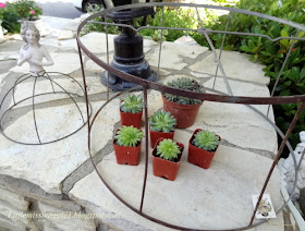
Here is another great find I found at the flea market last week. We have all seen these in our travels, but I have never purchased one. At first I thought this lovely lady was a small lamp shade missing her cover, but after working on her, I think she is a pin cushion form.
Whatever she started out as, now she is a beautiful delicate wire cloche. I think her porcelain skin is so delicate and she is posed so sweetly showing her modesty.
I tied off her waist with the sweetest vintage seam binding ribbon I bought from Kathee at Chateau et Jardin. I have several colors of this ribbon. It is so romantic. I have already used it in several of my photos. Check out Kathee's blog click here. She has a fabulous style and she sells at American Home in Ventura, California. She also carries Jeanne D' Arc Living magazine.
Milady is so sweet and modest covering herself in the most delicate way.
I placed her atop a beautiful piece of china with cookies.
This has a very romantic look. She could be used in the boudoir as well with vintage perfume bottles or beautiful soaps.
Isn't this ribbon to die for? I haven't asked, but I bet Kathee dyes it herself.
This is how Milady started out. I did another project with the lampshade that I also shared this week.
For both of these projects I used the 1/2 inch poultry wire. It's a smaller gauge for smaller scale projects. I did each section of her skirt separately. It took some time, but she was worth it. If you want to try this, you will need long needle nose pliers and wire cutters. That's it. Just cut your wire with the wire cutters and wrap the wire around the form with the pliers. I dry brushed her wire skirt with pewter gray acrylic paint and then dry brushed over that with light ivory just to spot lighten it. Then, of course, she got the beautiful ribbon sash and she was ready for her debut. Thanks for visiting us today. Hope you are having a fabulous week.
I'm partying at...
Mondays The House in the Roses Le Chateau des Fleurs The Graphics Fairy
Metamorphosis Monday
Tuesdays Knick of Time Tutus and Tea Parties Coastal Charm
Boogie Board Cottage
Wednesdays Savvy Southern Style Ivy and Elephants Faded Charm Cottage
Fine Craft Guild
Thursdays Embracing Change The Shabby Creek Cottage No Minimalist Here
Tablescape Thursday Delightfully Inspiring Thursdays
Fridays French Country Cottage My Romantic Home Miss Mustard Seed
At the Picket Fence Potpourri Friday Common Ground
The Charm of Home Decorating Insanity
Saturdays Funky Junk Interiors
Sundays It's Overflowing
Monday, May 14, 2012
Soap Label Coasters
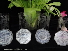
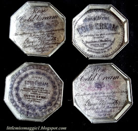
Graphics Fairy shared some old soap labels a while back and I have wanted to do a project ever since I saw them. When I found these four shell coasters, I knew exactly what to do with them.
First of all, to keep the transparency of the shells, I copied the graphics onto my homemade style tissue paper. For instructions, click here. Then I cut out the circles and decoupaged them onto my coasters. Three good coats seemed to do the trick.
They have maintained their shell-like quality and are still translucent. Just the look I wanted.
Pretty and feminine. Perfect for a tea party or a luncheon on the patio.
In the next photograph, I held the coaster up to the light. You can see how sheer it still looks.
They started out as plain Jane coasters and now they have some personality.
Here is how the tissue paper looked with the images transferred on to it. Notice I used used tissue paper. Seems to work better.
I'm partying at...
Mondays The House in the Roses Le Chateau des Fleurs The Graphics Fairy
Metamorphosis Monday
Tuesdays Knick of Time Tutus and Tea Parties Coastal Charm
Boogie Board Cottage
Wednesdays Savvy Southern Style Ivy and Elephants Faded Charm Cottage
Fine Craft Guild
Thursdays Embracing Change The Shabby Creek Cottage No Minimalist Here
Tablescape Thursday Delightfully Inspiring Thursdays
Fridays French Country Cottage My Romantic Home Miss Mustard Seed
At the Picket Fence Potpourri Friday Common Ground
The Charm of Home Decorating Insanity
Saturdays Funky Junk Interiors
Sundays It's Overflowing
First of all, to keep the transparency of the shells, I copied the graphics onto my homemade style tissue paper. For instructions, click here. Then I cut out the circles and decoupaged them onto my coasters. Three good coats seemed to do the trick.
They have maintained their shell-like quality and are still translucent. Just the look I wanted.
Pretty and feminine. Perfect for a tea party or a luncheon on the patio.
In the next photograph, I held the coaster up to the light. You can see how sheer it still looks.
They started out as plain Jane coasters and now they have some personality.
Here is how the tissue paper looked with the images transferred on to it. Notice I used used tissue paper. Seems to work better.
I'm partying at...
Mondays The House in the Roses Le Chateau des Fleurs The Graphics Fairy
Metamorphosis Monday
Tuesdays Knick of Time Tutus and Tea Parties Coastal Charm
Boogie Board Cottage
Wednesdays Savvy Southern Style Ivy and Elephants Faded Charm Cottage
Fine Craft Guild
Thursdays Embracing Change The Shabby Creek Cottage No Minimalist Here
Tablescape Thursday Delightfully Inspiring Thursdays
Fridays French Country Cottage My Romantic Home Miss Mustard Seed
At the Picket Fence Potpourri Friday Common Ground
The Charm of Home Decorating Insanity
Saturdays Funky Junk Interiors
Sundays It's Overflowing